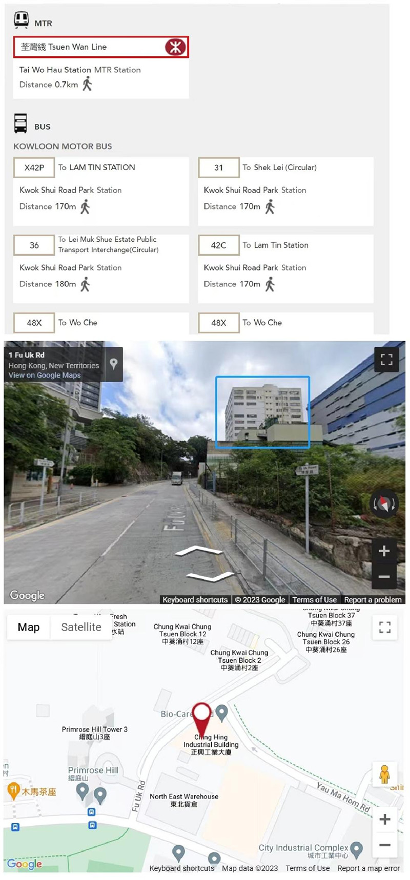
Increase the new warehouse of TOBE New Company in Hong Kong
The positioning and development direction of TOBE HK
TOBE's vision is, "Food is the most important thing for the people, and TOBE helps them".
TOBE's corporate mission is "Let everyone eat well".
The corporate image is red LOGO, other main colors are dark green, and grass green ,apple green, grass green, etc.
The specific TOBE products are fruits, food, frozen products, animals, plants and seafood.
The specific category divisions are TOBE Fruit, TOBE Food, TOBE Frozen Products, TOBE Animals and Plants, and TOBE Seafood.
The direction of TOBE supply chain is food and cooking.
The specific content of the supply chain is,
TOBE customs declaration, TOBE cold chain transportation, TOBE frozen warehouse, TOBE constant temperature warehouse, TOBE distribution, TOBE sub packaging
Relying on Hong Kong's free trade zone and international seaport, it is a gourmet paradise. Through the exclusive food frozen fruits and vegetables, animal and plant commodities at Wenjindu Port in Shenzhen,
Gradually radiate to the mainland of China, various ports and airport terminals, to do import customs clearance and import logistics.
Eventually, it will become an imported goods supplier that helps people obtain high-quality and high-quality goods.
www.tobehk.com, will also be built around this central idea and enterprise development direction.
The simplicity and freshness of four-petal flowers are used as the core values of CHING HING Enterprise to show to the public.
Four-petal flower, interpreted as follows
1. Red, in line with the flag colors of China and Hong Kong
2. In line with the type of bauhinia flower of the Hong Kong regional flag, the same series
3. The boss is the hostess, in line with women's style
4. Concise, atmospheric, full of fantasy,
5. Suitable for any sector of business, trade, logistics, import and export, investment, industry, etc. are all available.
6. Suitable for deformation, suitable for matching various products and text
7. jumping, lively
8, as opened
9. Deformation of X, Hong Kong's Xiang (Xiang), and ZHENGXING's Xing (Xing), the first letter of the pinyin
10. X is infinite, the largest, infinite, infinite.
11. A bird's-eye view of a budding flower bud
12. Head-up angle, bouncing and lively anthropomorphic flowers
13. The way the package is opened,
14, reinforced binding,
15. Right above the fruit, such as persimmons, such as mangosteen.
16. Originating from the red snail, the LOGO of AOTOWE Import and Export is vaguely related to the entire TOPONE Enterprise Group
17. The four-petal flower is a round shape that breaks through the outsourcing, and grows everywhere without end, implying that a blooming flower will grow wildly in all directions under the red sun.
18, such as two pairs of butterfly wings
19. The four petals on the periphery are like living fossils of thousand-year-old trees and leaves of ginkgo trees. It is also a quarter circle, and it is also a fan.
TOBE (HK) ENTERPRISE LTD.
Room B, Ching Hing Industrial Building,
19 Fu Uk Road, Kwai Tsing, NT,HK
TEL:(852)24231836 FAX:(852)24231896
Ms. Peach,tobe@tobecan.com 